
Tuesday, December 27, 2005
Lighthouse Composition
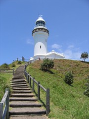
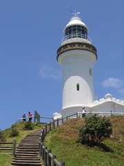
Which do you prefer? Going by the rule of thirds I think the one on the right works better, but I instinctively prefer the one on the left; I think the longer stairs draw your eyes up the hill to the lighthouse. What do you reckon?
If you could leave comments on why you voted the way you did I'd really appreciate it. Cheers!
[Tags: Photography, Composition, Australia]
Labels: Look


Read or Post a Comment
definitely more dynamic interest in the left pic. the line of the bannister runs right up the lighthouse too, nice.
I'm a big fan of the rule of thirds. But they're a little hard to compare because one is a wider angle shot, the other appears to be through a zoom lens.
The left leads your eye into the picture, and follows the curve of the stairwell. The right has good composition. I would tend to crop a little from the right hand side of the photo on the left and then compare the results.
Both good photos.
Cropping from the right seems to be a recurring bit of advice. I'll give that a go.